Press and Media
The current Bath Pride charity was formed to fill a gap in the LGBTQ+ community in the City of Bath. The trustees and organising committee have a variety of event and other experiences, from a wide range of ages, orientations, nationalities and gender identities. We aim to be inclusive in all that we do, and to bring joy and advocacy to the LGBTQ+ community in Bath.
Press releases
26 Jun 2025: BATH PRIDE 2025: FOLLOWING THE FIRST MAJOR PRIDE EVENT FOR THE CITY LAST YEAR
17 Jul 2024: BATH PRIDE 2024: FIRST MAJOR PRIDE EVENT FOR THE CITY
Flavour images
We are providing a few photographs of Bath Pride 2024, that can be used as community interest or other flavour images in articles that need them. Feel free to save and download them for press and media use.
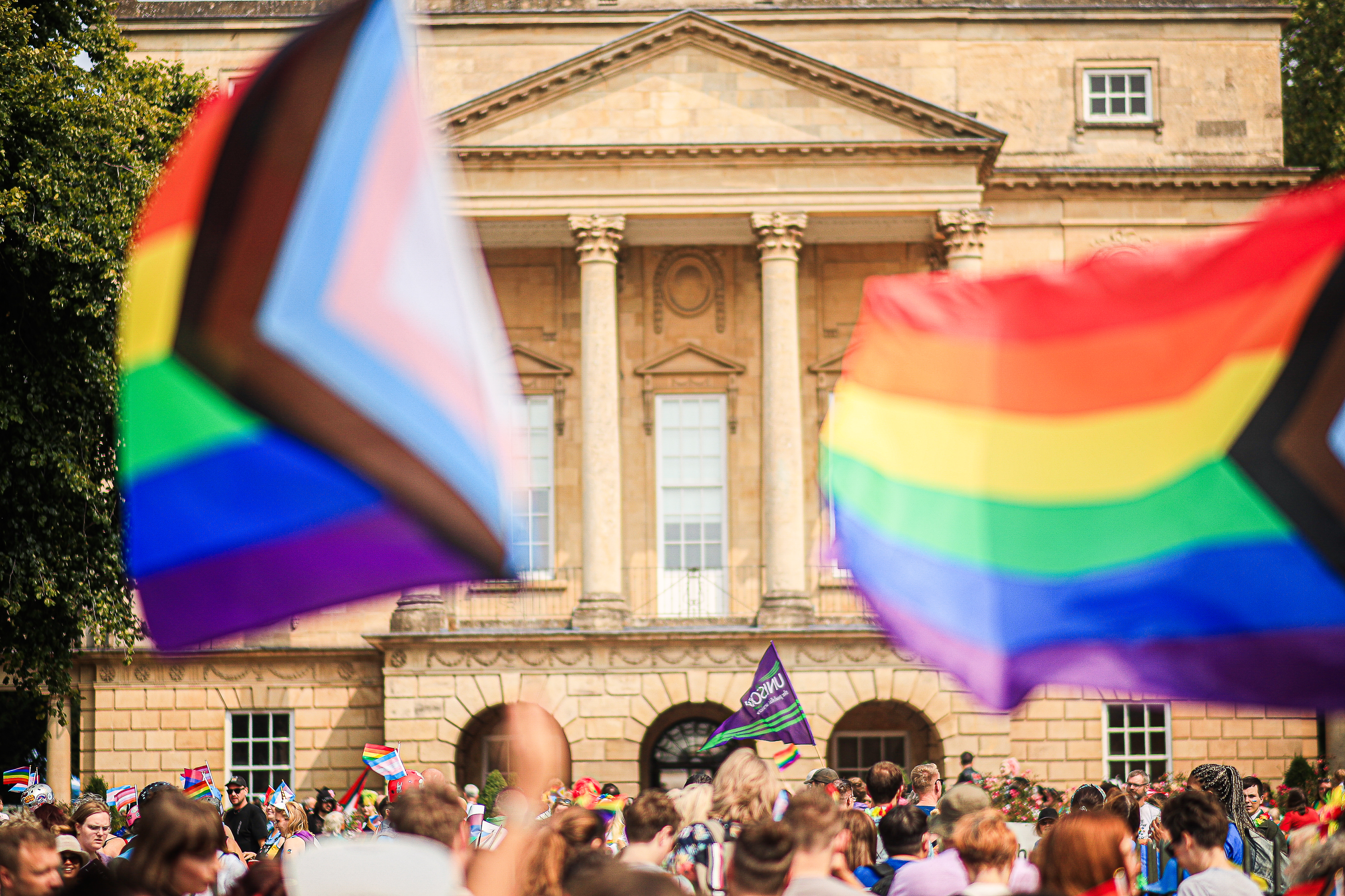
The Bath Pride 2024 march in front of the Holburne Museum.
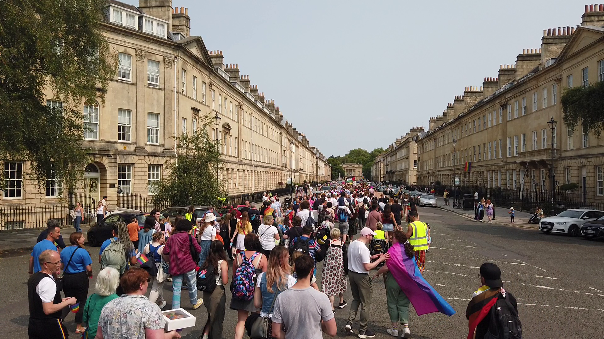
The Bath Pride 2024 march on Great Pulteney Street
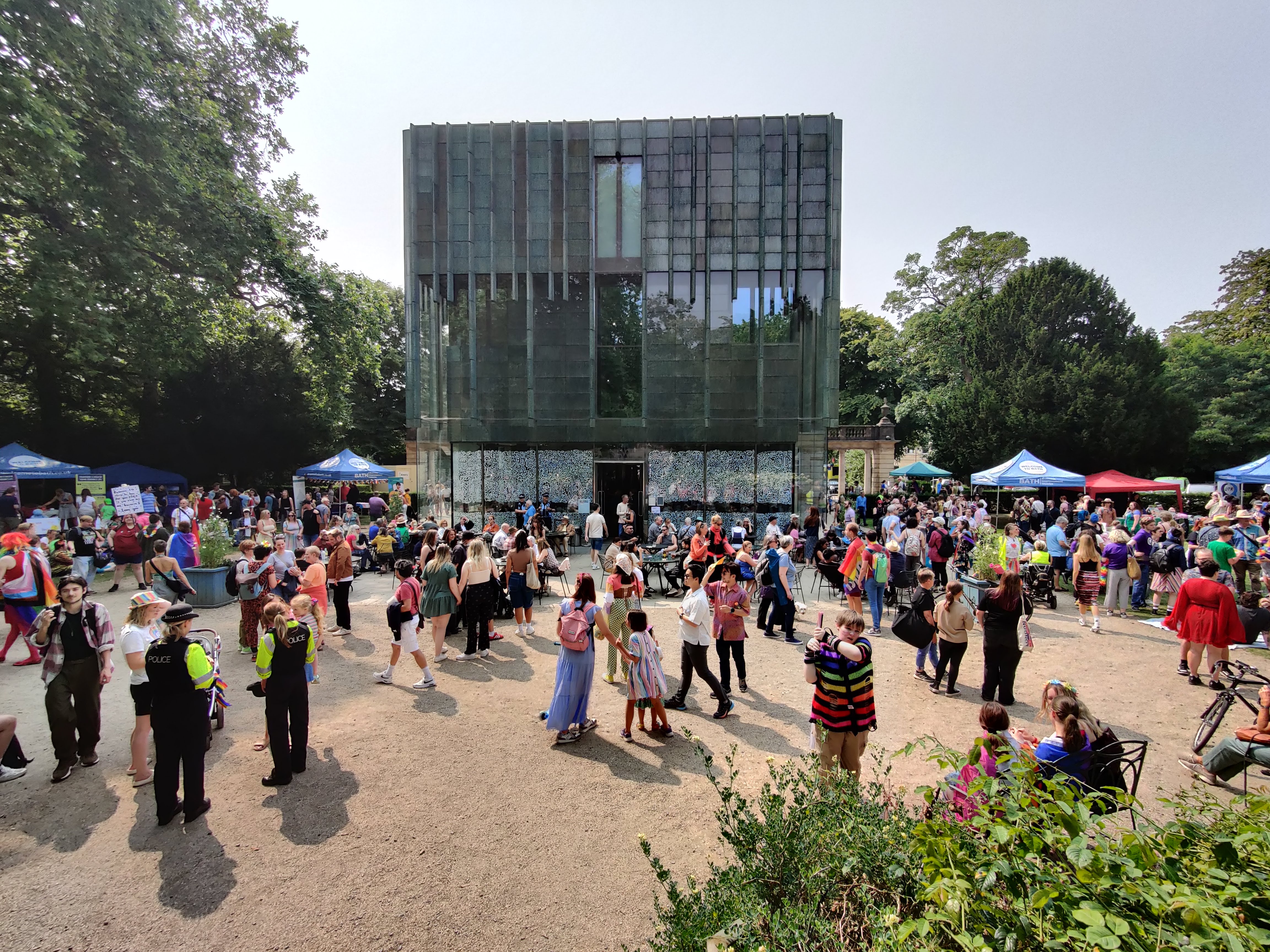
The Bath Pride 2024 picnic in the grounds of the Holburne Museum
Logos and Icons
Here are a selection of logos we use and their use cases. We ask that you do not alter these before using them, and particularly that the margin space around the iconography in the image is not trimmed to ensure good breathing room.
- Logo with Bath Stone background
- Logo with white background
- Logo with transparent background
- Alternate logo with transparent background
- Logo in black and white